
The situation
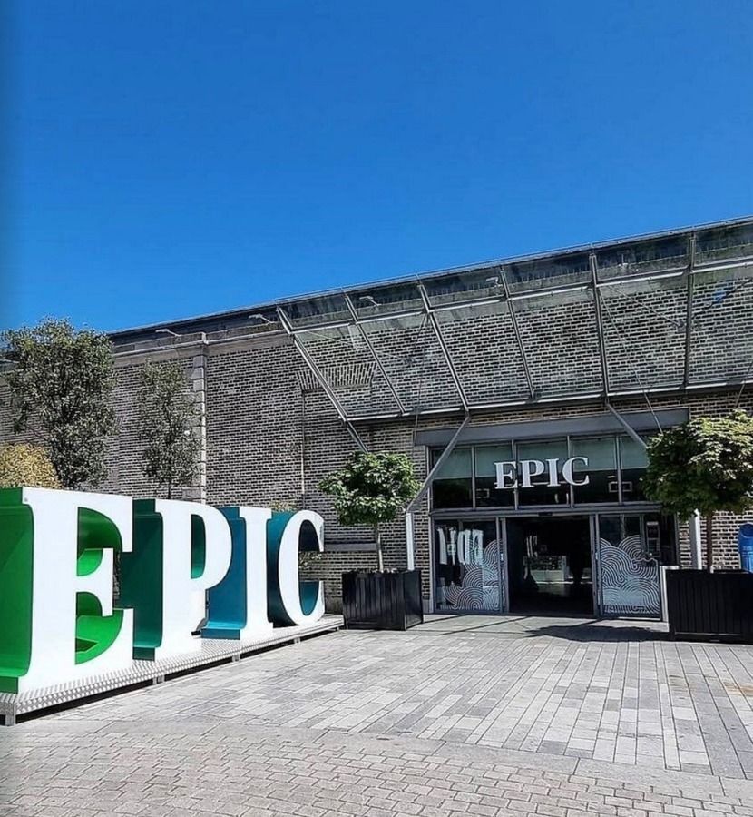
EPIC The Irish Emigration Museum sits in the CHQ building on Dublin's docklands. Visitors spend ninety minutes to two hours inside the exhibition, and every single one of them exits through the retail space.
Despite that, only around one in five bought something. A third walked straight out, a third moved through quickly, and the rest browsed.
Retail mattered for more than revenue. The shop was also a chance to round off the visit, strengthen the connection with EPIC and send people home as advocates.
The business was about to spend money refitting the shop. The design was nearly ready to go to tender.
What I did
I walked the visitor journey end to end, the way a guest walks it rather than the way the team knows it.
The most useful finding cost nothing to fix. Visitors didn't know they were leaving. The escalator delivered them out of the exhibition with no signal that they had entered a shop, and the first thing in front of them at the top was a hand sanitiser station. They arrived in waves, at pace, still in museum mode, and looked for the door.
Then I reviewed the proposed design before it went to tender, with the design team in the room, and marked up what was commercially wrong with it while it was still cheap to change. A fridge-magnet wall planned for a spot far from the tills came out of the drawings before it was ever built.
Alongside that: clear zones the visitor could read in a split second, the premium own-buy range moved into a key sightline, a stocked queue line, a pocket-money area for children, and merchandising principles the team could apply themselves.
What changed
The number that matters most is revenue per visitor. It rose 43% on the same footfall, in the same building, through the same doors. Nobody had to bring in more people. The people already walking through started buying.
None of the gain came from extra visitors. It came from the journey, the layout, what people could see, how the shop was merchandised and how easy it was to buy.
| KPI | Change |
|---|---|
| Revenue per visitor | +43% |
| Retail margin | Improved |
| Average transaction value | Increased |
| Visitor conversion rate | Improved |
| Retail revenue, August 2024 | +9% |
August figure is like for like, compared with August 2023.
“Her advice on layout, using insights on consumer behaviour, was invaluable. She is very business focused: all advice is geared towards generating revenue.”
Most of the recommendations were implemented. The threshold got a landing zone and a focal point. The shop was split into clearly signposted zones. The till moved between the two entrances and the queue line went in. The website gained a SHOP button beside BOOK TICKETS. The team extended their own-branded range, which is what carried the margin.
What made the difference
Two things.
They acted before the money was committed. A design review is worth many times more before tender than after.
And they were willing to hear that the problem wasn't the product. It was that nobody had told the visitor they'd arrived.
Most organisations look for growth by chasing more footfall. This project showed the value of first improving the journey that already exists. Growth does not always mean finding more customers. Sometimes the bigger opportunity is the people who have already chosen to come.
Your customers are already in the building. The question is whether anything tells them they've arrived.